SAXTONS DISTILLERY BRAND DEVELOPMENT
LOGO DESIGN, SIGNAGE, DIGITAL, SOCIAL, PRINT, COLLATERAL
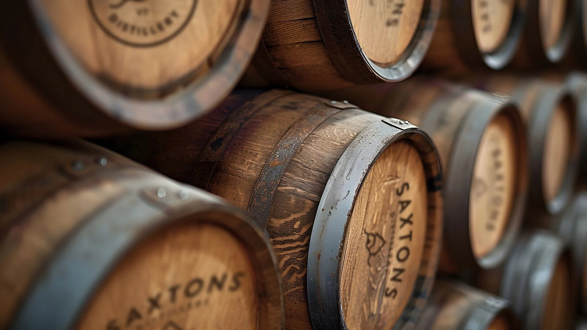
Saxtons Distillery was looking for an iconic brand mark that was easily recognizable and reflected the premium quality of their award winning products. They wanted something to set them apart from their competition. In Vermont, independent beverage labels run the gamut from zombie apocalypse chickens to wild lumberjacks sporting moose horns. Saxtons was searching for an updated classic, something that was true to their roots and also gave a nod to the serene Vermont backdrop.
Since the original distillery was built inside a watermill along the Saxtons River, we crafted a simple iconic monoweight solution that captured the spirit of the brand. The rhythmic wavy line representing the river had a nice seasonal duality - Not only is it the river during the warmer seasons, but it also connotes the tranquil soft snowdrifts along the sloping Vermont hillside during the winter season.